Onboarding project | Sprinto
How to do an onboarding teardown?
Take screenshots of each page of the interface, note each interaction and user touchpoint, and assess based on user empathy:
- What is working well on the screen and why?
- What is not working and why?
- What changes/improvements do you suggest can be made? Why do you think that would be better?
- Where does the “aha” moment occur?
- Evaluate your onboarding on the cognitive biases.
Registering for Demo
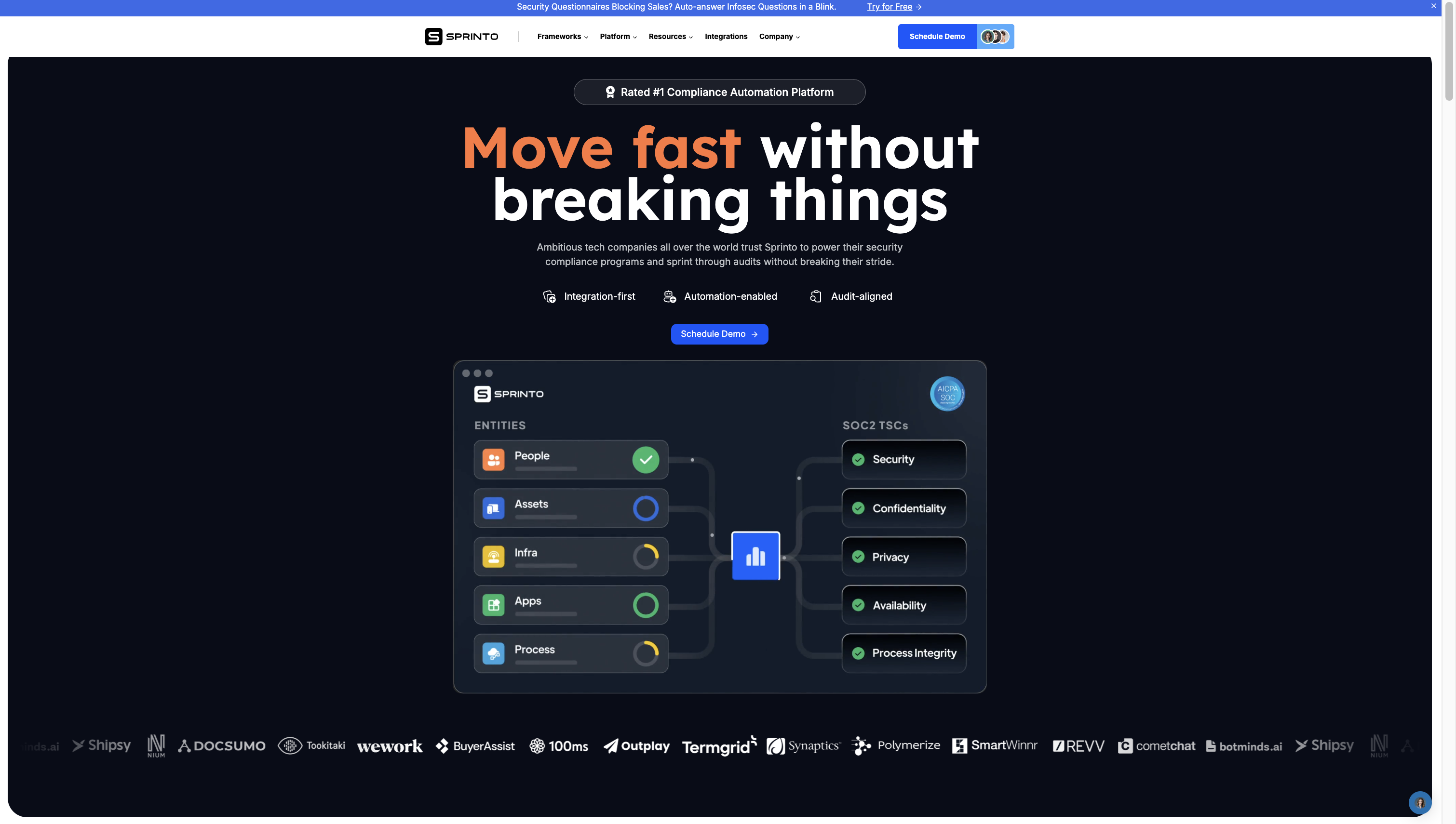
- What is working well on the screen and why?
- Rated #1 compliance platform build good confidence in the customer
- Move fast without breaking things, ambitious tech companies etc- These statements are psychological, if you are ambitious you should use Sprinto.
- Highlighting screenshot of how product would work basically information from People, Assets, Infra gets you SOC2 via Sprinto.
- Highlighting customer of multiple industries and sizes build lot of confidence
- What is not working and why?
- Integration-first, automation-enabled, audit-aligned are too technical and vague for people to understand
- Security Questionnaire product doesn't require demo, it can be directly used but it is not that visible at the top. Since it is direct trial product, people could easily derive value out of it and experience part of Sprinto and get the Aha moment reducing time requires to sell the product.
- What changes/improvements do you suggest can be made? Why do you think that would be better?
- Give more focus to security questionnaire , at the top near schedule a dem, add button called try security questionnaire for free. This will help people explore power of one of many modules of Sprinto for free, on first demo call they already come little more convinced
- Simplify the features mentioned-Ex instead of audit-aligned it should be simplified and easy audits.
- Where does the “aha” moment occur?
- Seeing the infographic of how Sprinto collects information for audit from multiple sources, processes it and make you ready for SOC-2
- Evaluate your onboarding on the cognitive biases.
- Move fast without breaking things, ambitious tech companies etc- These statements are psychological, if you are ambitious you should use Sprinto.
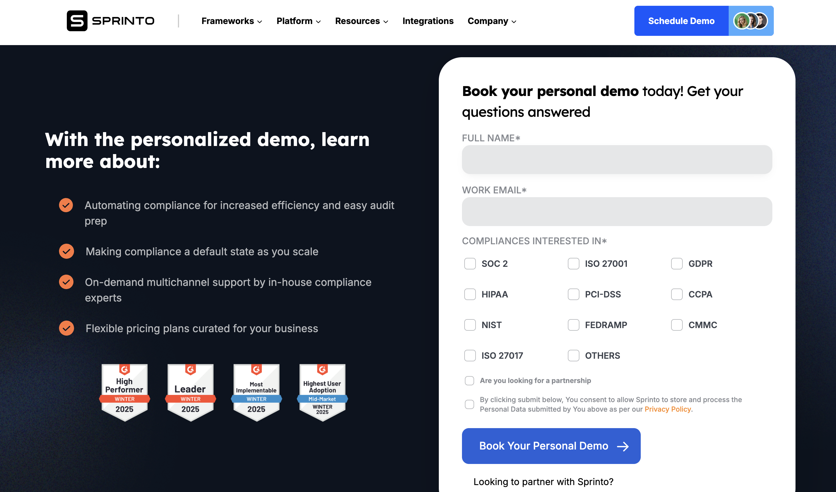
- What is working well on the screen and why?
- G2 leadership clearly shows Sprinto is loved by customer, providing huge value to customer
- Highlighting core value prop of Sprinto
- What is not working and why?
- In automation integrating with your major systems like cloud etc to automate evidence that should have been written. That provides much more context
- Asking prospect job title and company size would helped a lot. Instead of internal team searching all those info or internet or trying to figure out, it would have simplified the process. So if company was small someone who is expert in SMB sales would attend the call, while if larger customer, someone who understands mid-market or larger startups would attend the demo.
- Two times looking to partner with Sprinto mentioned, which can confuse the user.
- What changes/improvements do you suggest can be made? Why do you think that would be better?
- In automation integrating with your major systems like cloud etc to automate evidence that should have been written. That provides much more context
- Asking prospect job title and company size would helped a lot. Instead of internal team searching all those info or internet or trying to figure out, it would have simplified the process. So if company was small someone who is expert in SMB sales would attend the call, while if larger customer, someone who understands mid-market or larger startups would attend the demo.
- Attaching one or two screenshots of the products highlighting value prop would have given more confidence
- Where does the “aha” moment occur?
- Seeing core value prop and so many G2 reviews
Signup Link Generated
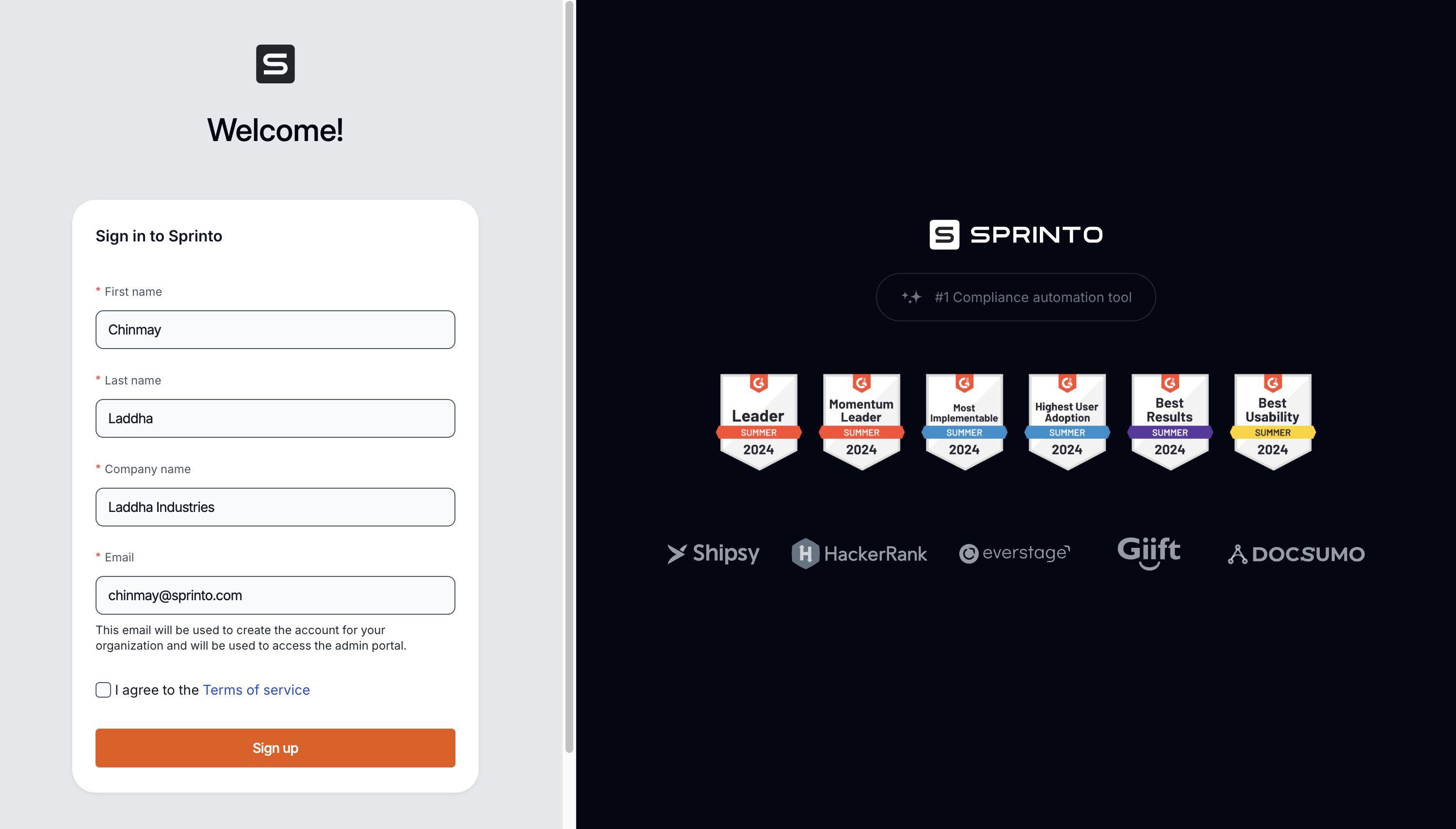
- What is working well on the screen and why?
- Clean, minimalistic sign-up form layout that’s easy to understand and fill out.
- Pre-populated company name field (coming from signup form filled by sales team), which reduces friction and ensures accuracy.
- G2 badges on the right side reinforce social proof and credibility, giving users confidence to proceed.
- Segmented layout—form on the left and trust badges on the right—balances user focus.
- What is not working and why?
- No mention of why the user should complete the sign-up (e.g., what they’ll get inside) — lacks a motivational CTA.
- No progress indicators or hints about the next steps—users may wonder what happens after sign-up.
- Trust badges are repeated multiple times, leading to potential clutter and distraction.
- The Terms of Service checkbox is small and easy to miss—some users might not check it, causing friction at submit.
- What changes/improvements do you suggest can be made? Why do you think that would be better?
- Add a short subtext (e.g., "Start your free trial and experience how Sprinto automates compliance") near the form header to motivate users.
- Include a small “What happens next?” below the Sign-up button to set expectations and reduce anxiety.
- Consolidate G2 badges—use a single, horizontally scrollable section to avoid repetition and visual clutter.
- Increase the size of the Terms of Service checkbox or make it more prominent to ensure it’s not missed.
- Where does the “aha” moment occur?
- When users see their company name pre-filled, reinforcing that Sprinto already knows them—this makes the process feel personalized and seamless.
- Evaluate your onboarding on the cognitive biases.
- Authority bias—G2 badges provide social proof, reinforcing that Sprinto is a trusted compliance solution.
- Familiarity bias—seeing their company name pre-filled builds trust and reduces friction.
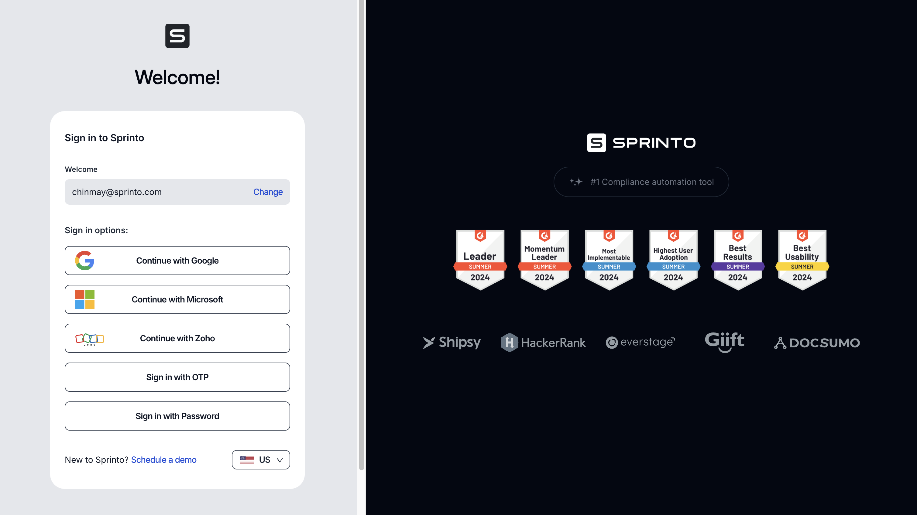
- What is working well on the screen and why?
- Multiple sign-in options (Google, Microsoft, Zoho, OTP, Password) give users flexibility and cater to various preferences and IT setups.
- The pre-filled email address provides context and reduces friction—users know exactly which account they’re signing in with.
- The design is clean and minimal, with plenty of white space, reducing cognitive load.
- The "Change" option next to the email allows users to correct any errors without needing to backtrack.
- What is not working and why?
- The sign-in options list might feel overwhelming—no hierarchy or recommended option to guide the user.
- The repeated presence of the G2 badges might become banner fatigue or visually cluttered after multiple screens.
- The "New to Sprinto? Schedule a demo" link here feels out of place—this is a sign-in screen, not a discovery or marketing touchpoint.
- There’s no clear progress indicator or heading clarifying why the user is here or what comes next in the onboarding journey—feels transactional.
- What changes/improvements do you suggest can be made? Why do you think that would be better?
- Highlighting new features which were not mentioned before would build more anticipation. Or one-two screenshots of how the information they added would appear will build anticipation
- Add a recommended sign-in option (like Google SSO) to reduce decision fatigue and guide users to the preferred, fastest experience.
- Consider grouping sign-in options visually or adding small icons to reduce text clutter.
- Remove or reposition the "New to Sprinto? Schedule a demo" link—perhaps move it to a secondary CTA or footer.
- Add a progress indicator or heading like "Step 2 of 3: Sign In" to reassure users they’re progressing toward activation.
- Consolidate the G2 badges into a single, clean line or popover rather than repeating them on every screen.
- Where does the “aha” moment occur?
- The multiple SSO options can create an “aha” moment—users realize they can sign in securely and conveniently without managing new passwords.
- Evaluate your onboarding on the cognitive biases.
- The pre-filled email uses the consistency bias—users feel committed to the email they entered and are more likely to complete sign-in.
- Social proof bias is leveraged via the repeated G2 badges.
- However, the choice overload bias might slow decision-making given the unranked list of sign-in options.
Post Successful Sign-in
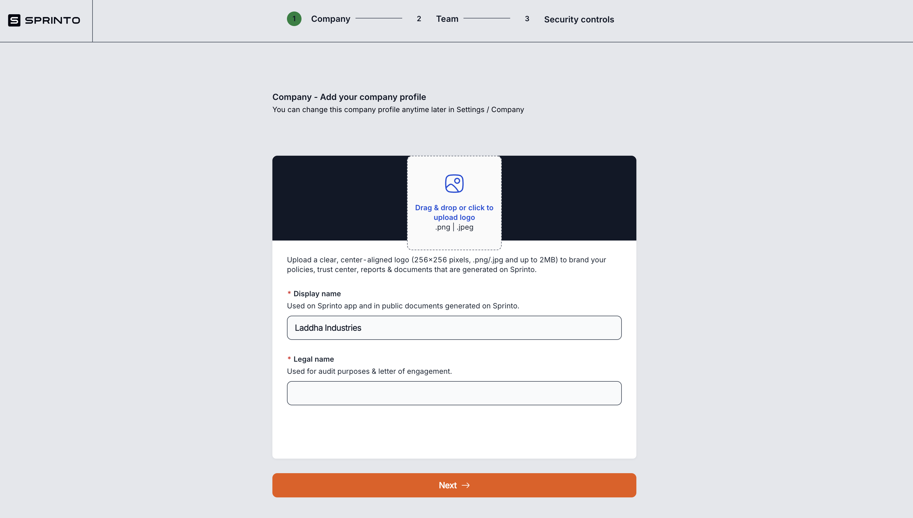
- What is working well on the screen and why?
- The step-based progress bar (Company > Team > Security controls) at the top effectively sets user expectations and reduces anxiety by showing the path ahead.
- Clearly highlighting what this page is about like related to adding company info
- Clean, minimalist design with plenty of white space reduces clutter and helps users focus on the task at hand.
- Clear labels (“Display name” and “Legal name”) along with helpful descriptions ensure users understand where each field is used.
- The large, prominent “Next” button at the bottom stands out and invites action, promoting flow through the onboarding.
- What is not working and why?
- The logo upload step feels like an unnecessary hurdle this early—could be optional or deferred to later, especially if users are eager to get into the product quickly.
- The description for Legal name is too brief (“Used for audit purposes & letter of engagement.”) — some users might not know what a letter of engagement is.
- What changes/improvements do you suggest can be made? Why do you think that would be better?
- Highlighting new features which were not mentioned before would build more anticipation. Or one-two screenshots of how the information they added would appear will build anticipation
- Add a tooltip or info icon next to “Legal name” explaining what a “letter of engagement” is and why it matters.
- Include visual confirmations (like a checkmark or subtle animation) when the user completes a field to provide a sense of progress.
- Provide an example of a typical “Legal name” format (e.g., “Acme Inc.”) to help users understand what’s expected.
- Consider adding a “Save for later” option or autosave, so users feel more confident that their data is retained even if they leave the page.
- Where does the “aha” moment occur? No aha moment on this page
- Evaluate your onboarding on the cognitive biases? Ans: Progress indicator bias: The step tracker at the top makes users feel they’re already putting in effort and investing time, which increases their sense of commitment and makes them more likely to continue and complete the onboarding.
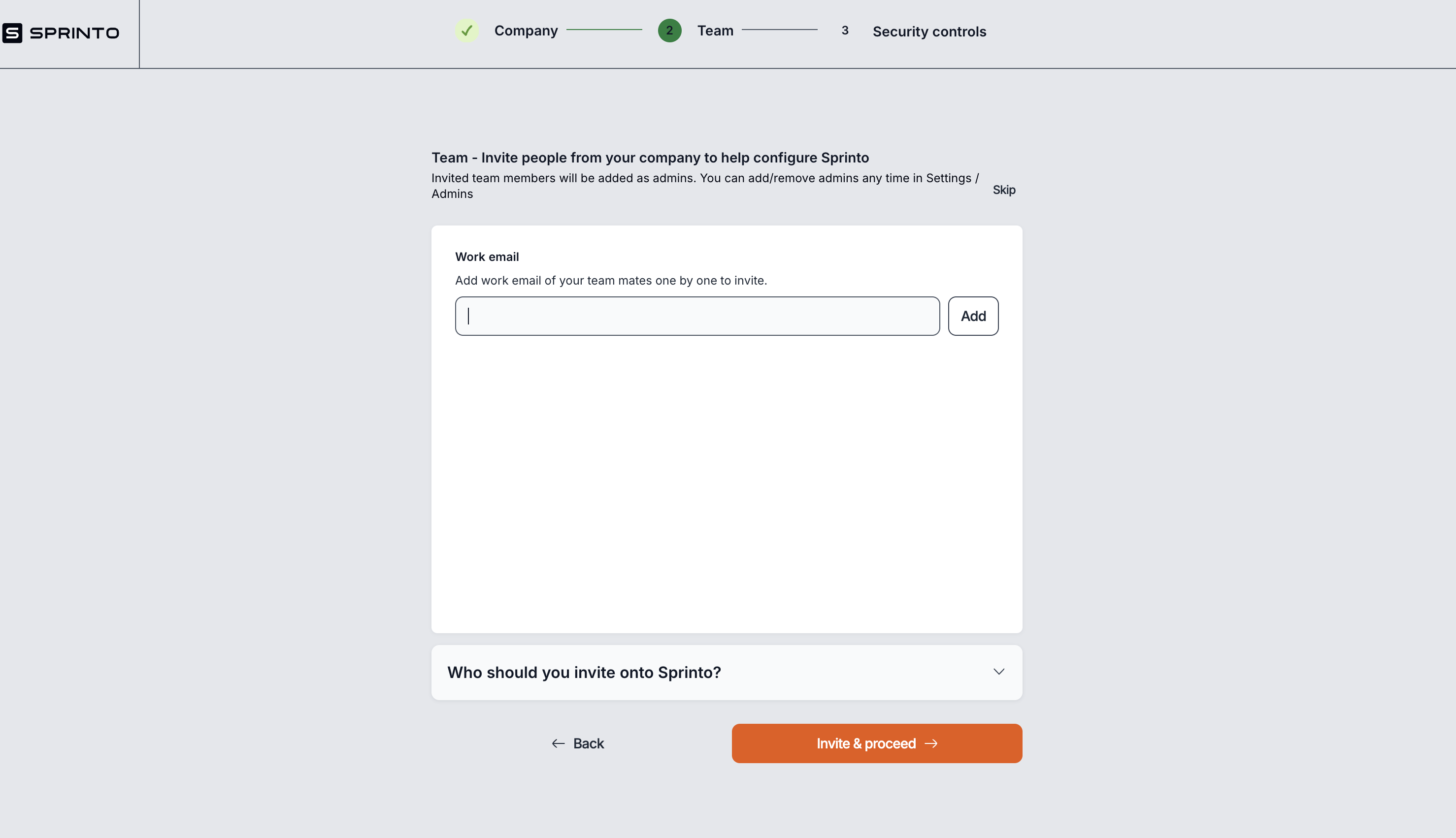
- What is working well on the screen and why?
- The step progress indicator at the top (Company → Team → Security Controls) visually guides users through the onboarding flow and keeps them oriented.
- Clear, concise instructions about inviting team members support collaboration and make the product more effective as multiple admins can configure the tool.
- The “Invite & proceed” button is visually prominent, guiding the user towards the next step.
- Details about who should be invited
- Addition of skip button(thought it's UI is not good)
- What is not working and why?
- The “Skip” text is not clearly a button—it blends in with the instructional text, so users may overlook this option if they’re not ready to invite teammates.
- There's no immediate indication of what happens after inviting someone. Users might feel uncertain about next steps or whether the invited users get notified right away.
- The UI feels sparse and could feel empty
- What changes/improvements do you suggest can be made? Why do you think that would be better?
- Make the “Skip” text more visually distinct as a button (e.g. border, background, different color) to clearly indicate that it’s an actionable step.
- Add a short subtext or tooltip explaining why inviting teammates is recommended (e.g. “Inviting colleagues now helps you get started faster with Sprinto.”).
- Should allow adding multiple email id in one-go instead of clicking add everytime
- Where does the “aha” moment occur? Ans: There is no significant “aha” moment on this screen
- Evaluate your onboarding on the cognitive biases.
- Commitment bias: By adding teammates, users signal a higher intent to engage with the product, increasing the chance they’ll proceed to the next steps.
- Social proof: Inviting teammates indicates collaboration and can make users feel like they’re aligning with organizational norms.
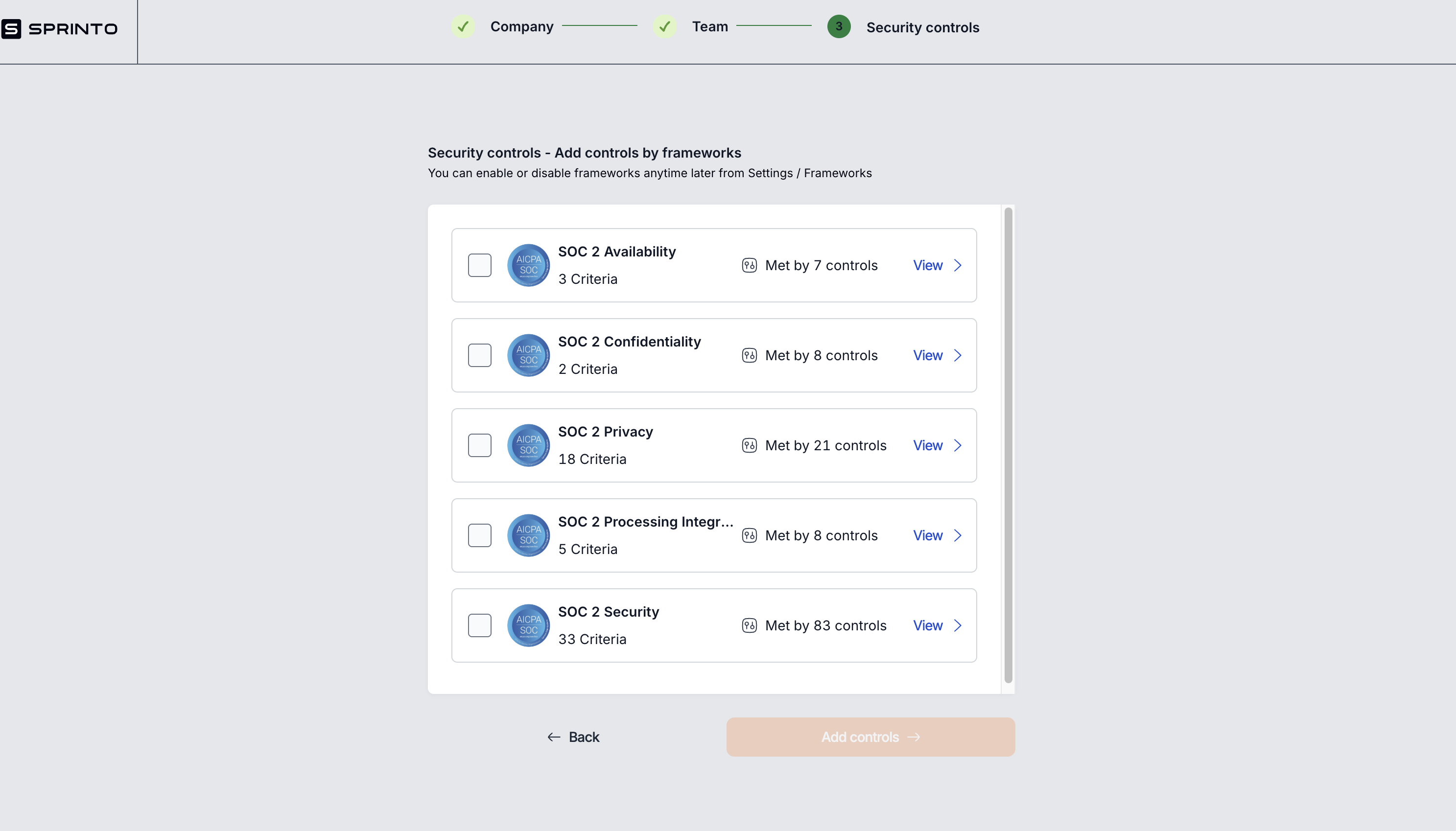
- What is working well on the screen and why?
- The clear, step-by-step progress indicator at the top helps users understand where they are in the onboarding process and what comes next.
- Displaying framework names with criteria counts and controls met status gives users an overview of their compliance progress and fosters trust.
- The “View” link on each framework allows users to explore details further, promoting transparency.
- A helpful note clarifies that frameworks can be enabled/disabled anytime later in Settings, which reduces fear of making a wrong choice.
- What is not working and why?
- The terms “Criteria” and “Controls” may be confusing for users unfamiliar with compliance terminology—especially without definitions or tooltips to explain them.
- Users might not fully understand the significance of these frameworks or why they’re selecting them at this step.
- The selection boxes feel low priority—there’s no guidance or recommended selections based on the customer’s use case or demo input.
- The “Add controls” button is disabled by default (greyed out), but it’s not obvious why or how to enable it (e.g. select frameworks first).
- What changes/improvements do you suggest can be made? Why do you think that would be better?
- Add short tooltips or info icons explaining “Criteria” (framework-specific requirements) and “Controls” (Sprinto’s mapped features/steps that help meet those criteria).
- Provide a recommended frameworks prompt (e.g. “Based on your earlier selections, we recommend starting with SOC 2 Security.”).
- Show a clear explanation above the list that highlights that these frameworks are optional and can be adjusted anytime (reduce fear of commitment).
- Where does the “aha” moment occur?
- Select frameworks that align with their compliance needs.
- Toggle frameworks on/off anytime later, giving them control over their compliance journey.
- See criteria and control mapping in one place, understanding how Sprinto automates their audit readiness.
- Evaluate your onboarding on the cognitive biases? Ans : Allowing users to choose frameworks and see progress builds confidence and a sense of control.
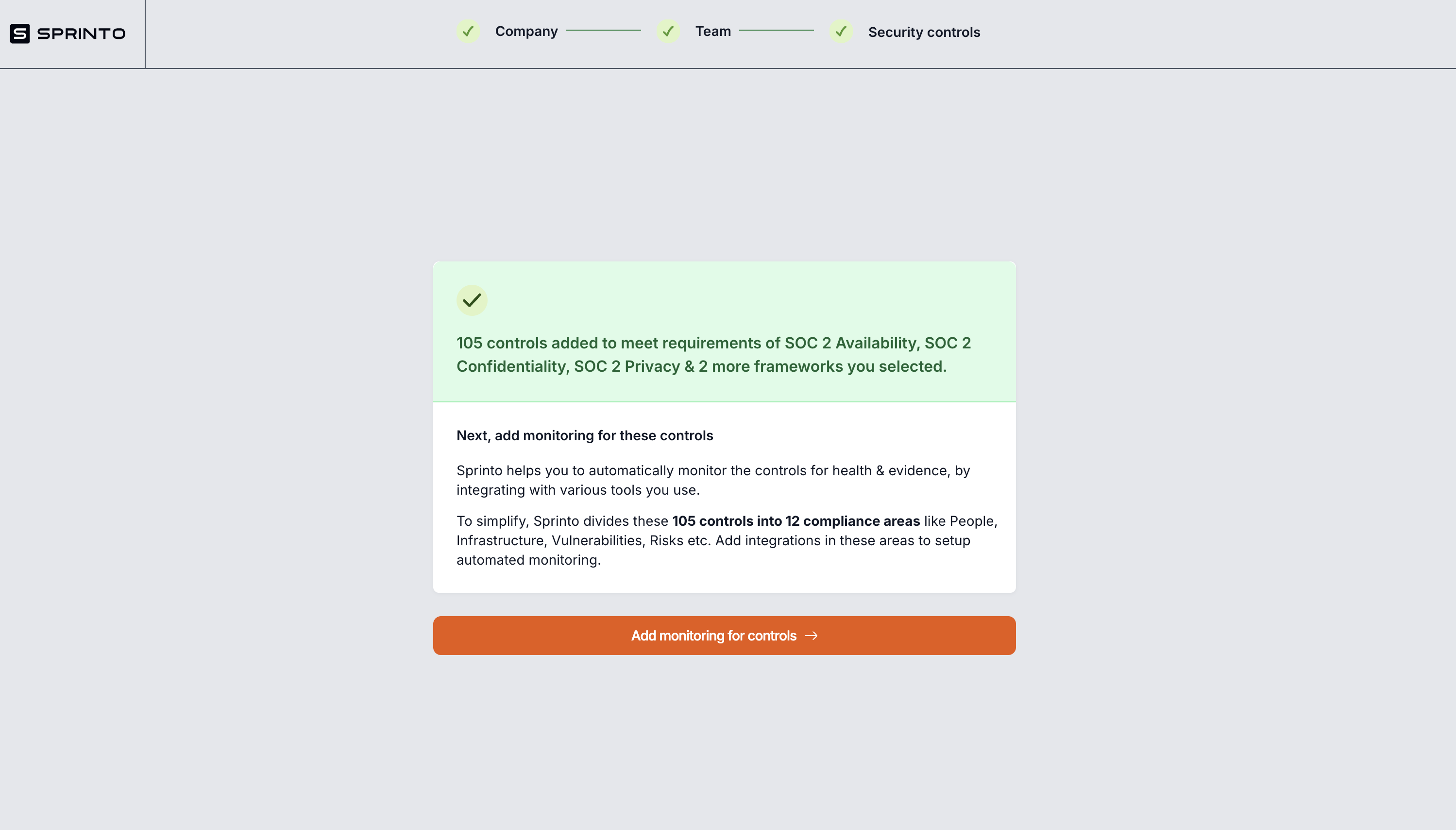
- What is working well on the screen and why? Ans: The green box with a checkmark reinforces progress and highlights that 105 controls were automatically added.
- What is not working and why?
- This screen interrupts the onboarding flow. After selecting frameworks, users should feel momentum; instead, this screen feels like a detour and is not immediately actionable.
- The text is dense and explains complex information about 12 compliance areas, which might feel overwhelming to a new user.
- Users haven’t seen the dashboard yet, so they have no anchor point for what these controls mean, how they relate to tasks, or where they live in the product.
- What changes/improvements do you suggest can be made? Why do you think that would be better?
- Instead of a standalone screen, this information could appear as a contextual popup on the dashboard after selecting frameworks. This would keep the user in the flow, let them see their controls right away, and offer a sense of accomplishment.
- Use visuals or icons to explain the concept of areas like Risks and Vulnerabilities, and how they connect to modules in Sprinto.
- Consider a short tour or guided walkthrough that demonstrates how to monitor controls and areas directly from the dashboard, making the onboarding flow seamless.
- Where does the “aha” moment occur? Ans: The “aha” moment would ideally occur on the dashboard, where users can see how their controls and criteria populate actionable tasks. Seeing real progress toward SOC 2 or other frameworks would show how Sprinto’s automation helps them get closer to audit readiness.
- Evaluate your onboarding on the cognitive biases? Ans: Nothing major. Still Framework mentions like SOC 2 lend credibility and help build trust—but should be tied directly to product functionality that users can interact with.
Landing Page
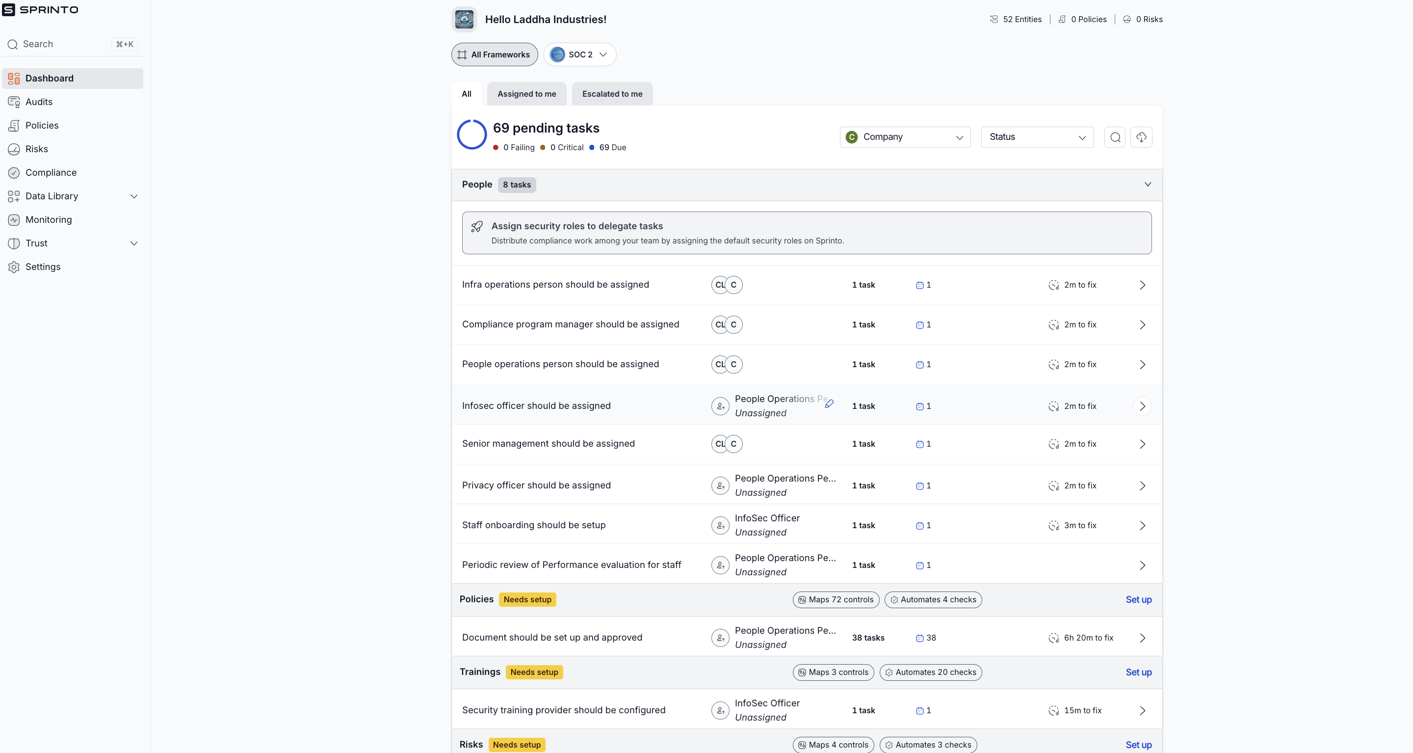
- What is working well on the screen and why?
- The dashboard clearly shows the number of pending tasks, helping users understand that there is work to be done.
- Tasks are categorized under different headings like Policies, Trainings, and Risks, providing structure and breaking down complexity.
- Each task includes helpful details like who is responsible, time estimates, and task counts, making it easier to plan and prioritize.
- What is not working and why?
- The greeting “Hello Laddha Industries!” is helpful, but the dashboard could benefit from a stronger, more welcoming tone to make new users feel comfortable.
- Displaying 69 pending tasks upfront can feel overwhelming, especially for a new user. This could discourage engagement or make users feel like they’re already behind before they even start.
- All tasks are revealed at once, without prioritization or guided onboarding. New users might not know which tasks to tackle first, leading to decision paralysis.
- What changes/improvements do you suggest can be made? Why do you think that would be better?
- Add a warm welcome message like “Welcome to Sprinto! Let’s get started on your compliance journey” to build user confidence and excitement.
- Use progressive disclosure or task batching—reveal one task at a time or guide users through an initial, smaller list of high-impact tasks first, then expand to show the rest once they’re comfortable.
- Highlight one or two key tasks with “Start here” or “Your first steps” to help users focus and build momentum.
- Where does the “aha” moment occur?
The aha moment is when users realize that Sprinto has simplified SOC2 compliance by listing clear, actionable tasks instead of forcing them to interpret complex SOC2 criteria themselves. This removes confusion, accelerates progress, and builds confidence in their compliance journey.
- Evaluate your onboarding on the cognitive biases? Ans: Simplification Bias: Sprinto has effectively reduced the complexity of SOC2 by translating it into simple, actionable tasks, which is a positive example of this bias at work.
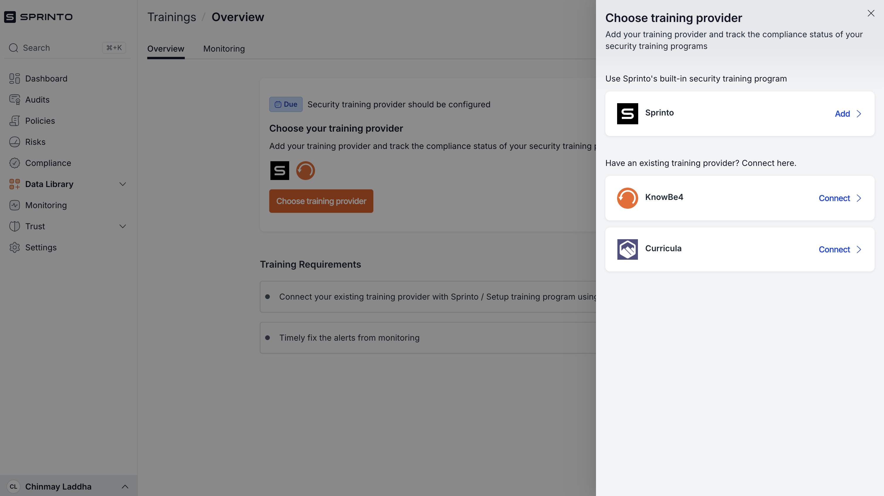
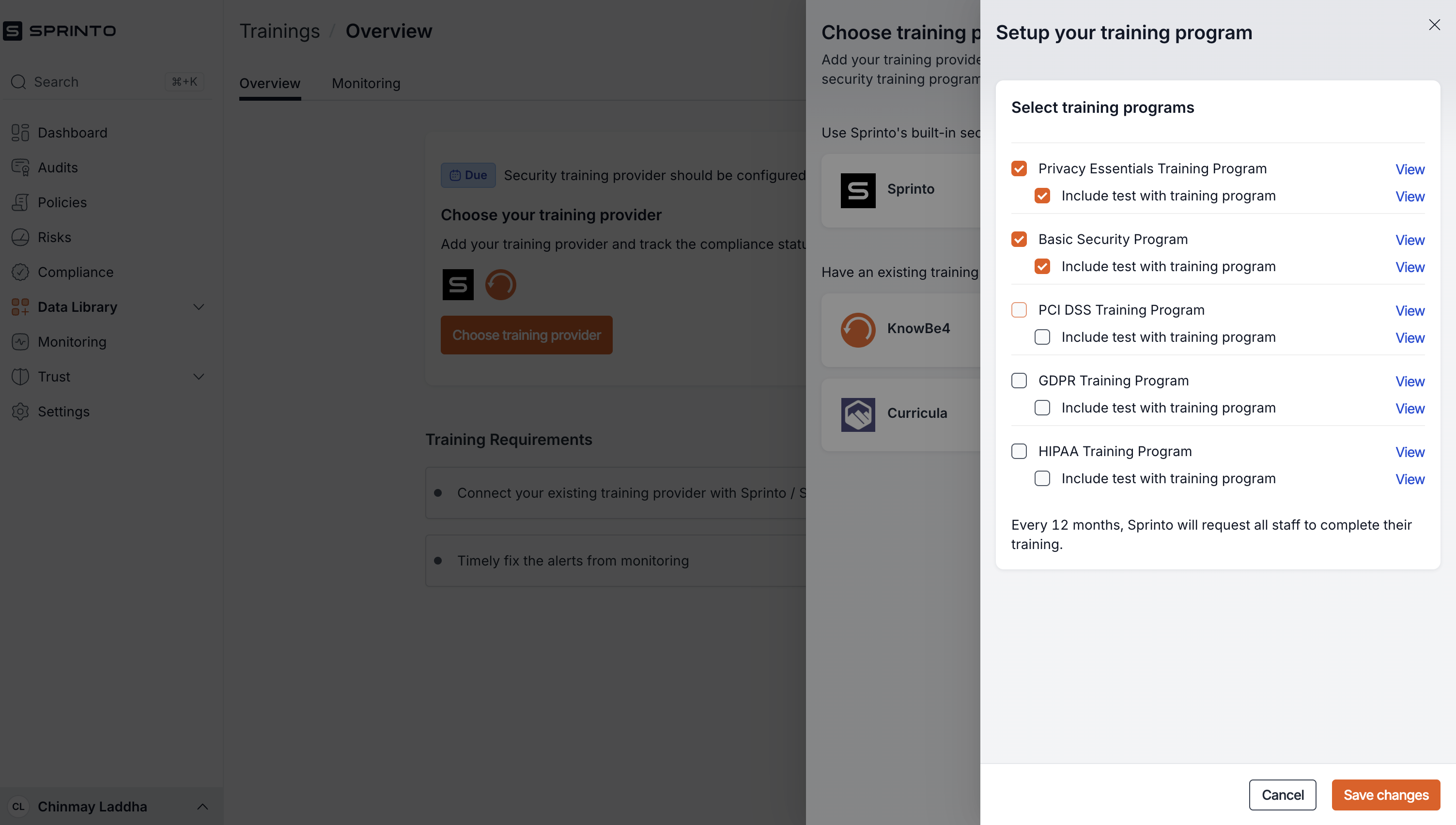
Setting up Modules
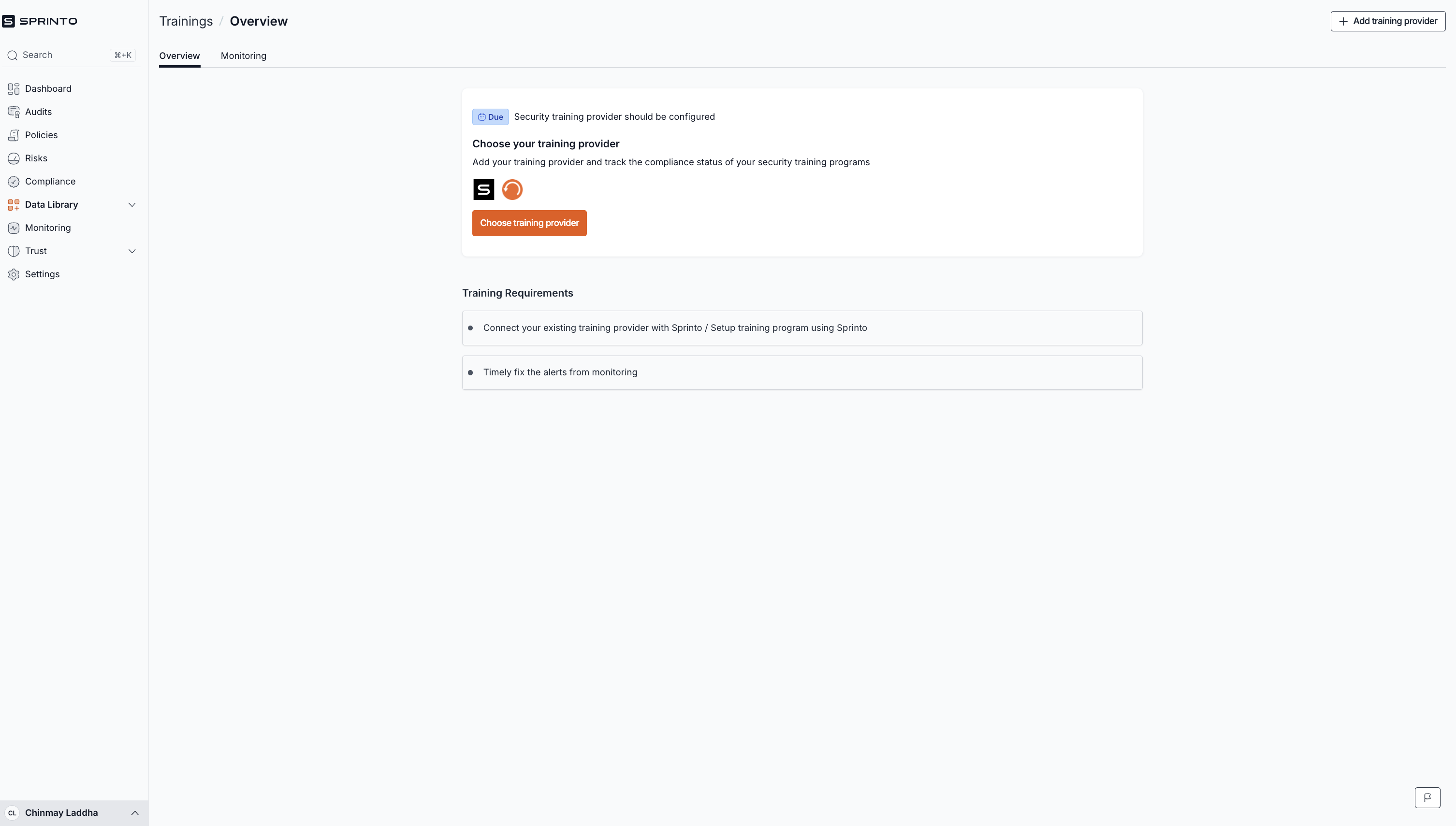
Next step in configuration and first milestone
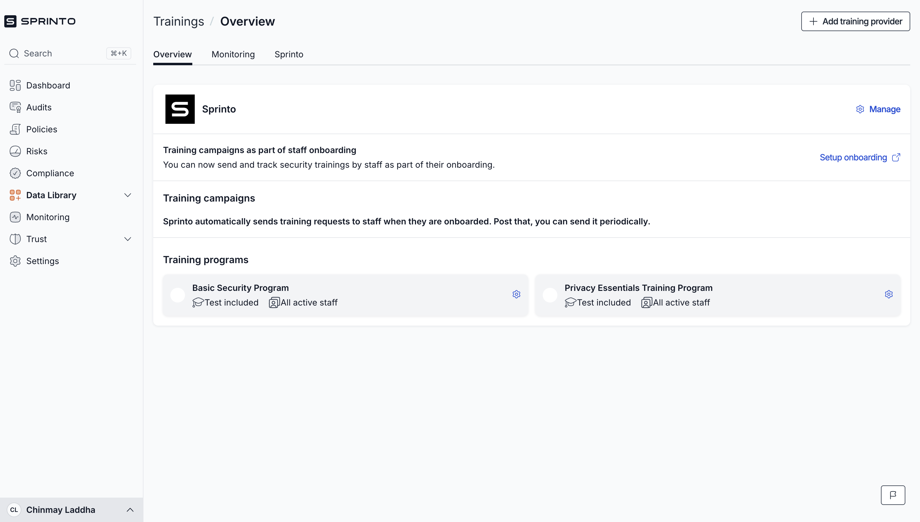
- What is working well on the screen and why?
- Clean UI and straightforward flow: The design is minimal and easy to navigate, which is good for guiding users step by step.
- Clear labeling of steps: The use of labels like "Due" and the logical flow from choosing a provider → connecting → selecting training programs is intuitive and sequential.
- Drawer consistency: The consistent drawer component on the right side keeps the user in context while adding more steps instead of redirecting them elsewhere.
- Use of real logos (KnowBe4, Curricula, etc.): Builds trust and helps users quickly recognize known training providers.
- Grouping by categories: Training programs are grouped logically with toggles to include/exclude tests, giving users flexibility.
- Small wins from integrations: Sprinto highlighting integrations like KnowBe4 reduces friction for users who already use other systems.
- Reminder that staff must complete training every 12 months: A subtle nudge about ongoing compliance encourages users to plan ahead.
- What is not working and why?
- Too many nested drawers: The flow is drawer after drawer—this can be overwhelming, making it feel like users are stuck in a never-ending loop of pop-ups.
- First screen just shows logo of KnowBe4 and Sprinto: Curricula and other integrations are not highlighted. User might think only Sprinto training and KnowBe4 are supported.
- Lack of contextual explanation: For training categories like PCI DSS, GDPR, HIPAA, etc., there's little explanation about why or when to use them. Users without deep compliance knowledge might get stuck here.
- First screen is too basic: The initial "Choose your training provider" screen lacks a compelling explanation of why you should choose a provider or how this step fits into the overall compliance journey.
- No progress indicator or breadcrumbs: Without a progress bar or steps indicator within the drawers, users don’t know how many steps are left.
- What changes/improvements do you suggest can be made? Why do you think that would be better?
- Reduce the number of nested drawers: Instead of multiple drawers stacked on each other, consider consolidating them into a single screen with collapsible sections for different training providers and categories.
- Add tooltips or brief explanations: For each training program (e.g., PCI DSS), add a short explanation: "Required for PCI DSS compliance certification audits" etc. This helps users make informed decisions.
- Add a step tracker or progress bar: Let users know how far they are in the setup process. Example: “Step 2 of 4: Select Training Programs.”
- Highlight the value proposition earlier: The first screen should clearly state the benefits of connecting training providers, e.g., “Automated monitoring, test tracking, compliance health scores.”
- Show potential impact: Visualize the percentage of training completion or potential time savings after setup—this would give users a stronger reason to complete onboarding.
- Where does the “aha” moment occur?
- Once users see Sprinto’s own training programs and the integrations with providers like KnowBe4 and Curricula. The realization that Sprinto can centralize and automate training compliance (vs. manually managing training records) can be a key “aha” moment.
- Evaluate your onboarding on the cognitive biases.
- Commitment Bias: Users are likely to continue completing setup steps once they start (drawers keep them inside the flow).
- Authority Bias: The inclusion of established training providers like KnowBe4 reinforces Sprinto’s credibility.
Going back to dashboard- New Health dashboard unlocked
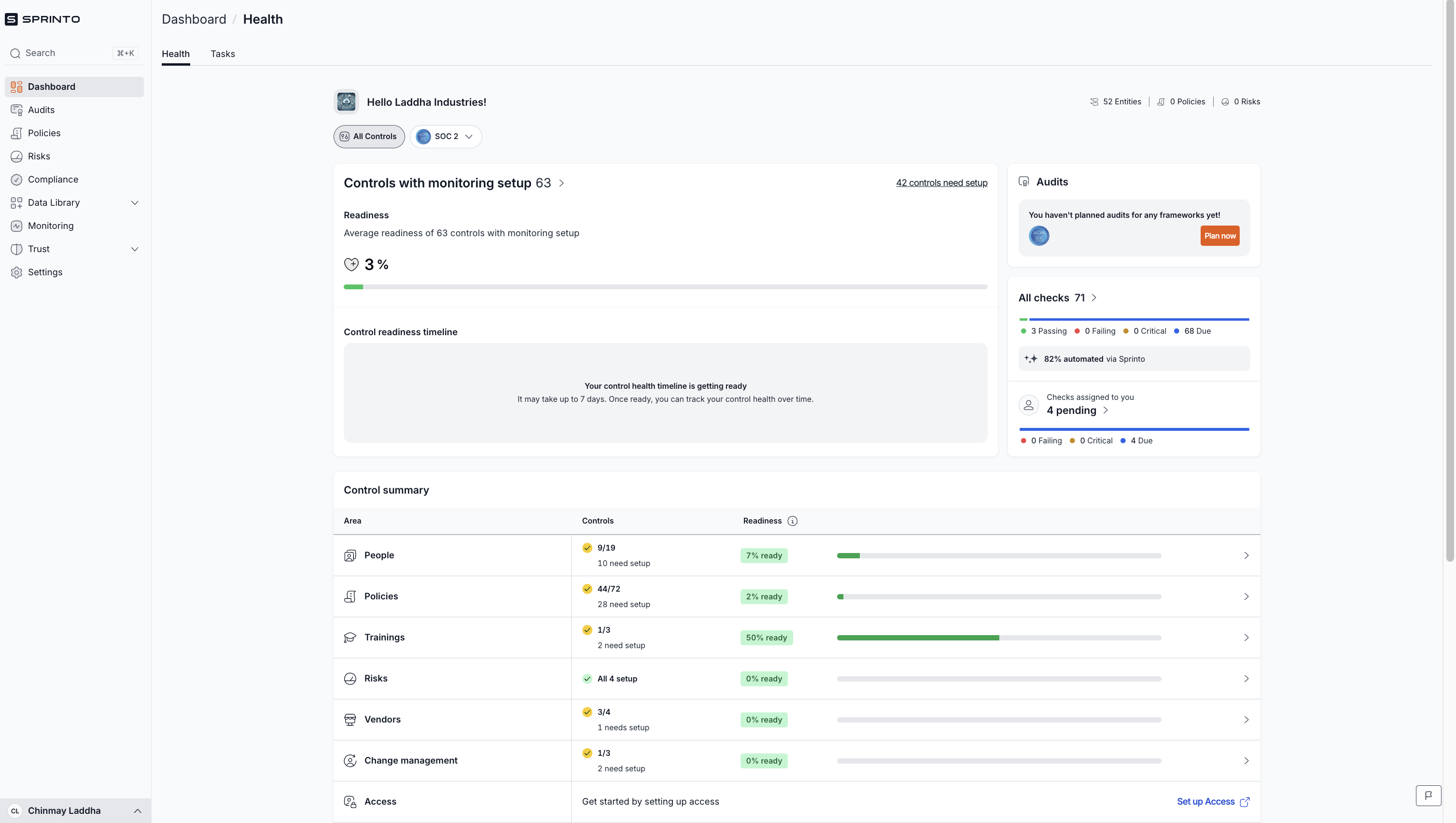
- What is working well on the screen and why?
- Health Dashboard:
- Provides a clear sense of progress through the Readiness Percentage and Control Summary. This aligns with the user’s mental model of seeing progress towards compliance.
- Visual breakdown by area (e.g., People, Policies, Trainings, Risks) helps users prioritize what to focus on next.
- The 82% automated checks badge is a great trust-builder—it highlights Sprinto’s efficiency and value proposition.
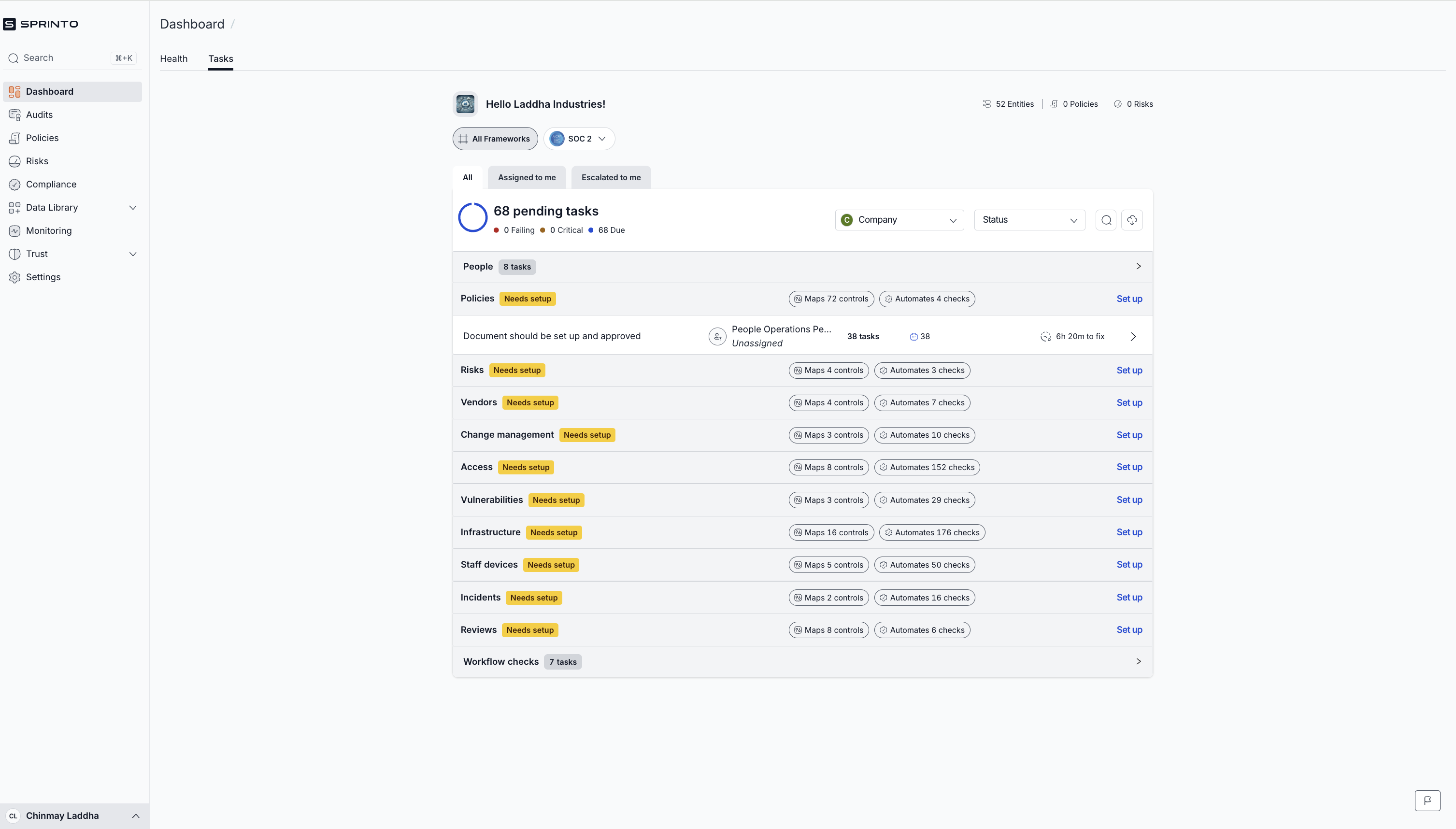
- Tasks Dashboard:
- Organizes tasks by categories (e.g., Policies, Risks, Vendors) which aligns with how compliance teams often structure their work.
- Clearly shows pending tasks, making it easy for users to see what needs attention.
- Good use of labels like Needs Setup to guide the user toward what actions to take next.
- Health Dashboard:
- What is not working and why?
- Health Dashboard:
- No celebratory feedback when users complete tasks or set up modules (no confetti, no "Great job!" message) — this misses an opportunity for an Aha moment.
- “Control readiness timeline” is too vague—users might not understand what "7 days" means without context.
- Users might be confused about why some categories show low readiness percentages even after completing many tasks—this can undermine confidence.
- Tasks Dashboard:
- Information overload—presenting too many tasks at once can overwhelm users. Could benefit from progressive disclosure (showing a few tasks and unlocking more as they progress).
- The hierarchy between “Tasks” and “Health Dashboard” is unclear; users might not know when to use each.
- The system doesn’t highlight why some tasks are no longer visible (like Trainings after completion). A simple tooltip or message like “This area is completed. New tasks will appear when you import more data” would help.
- Health Dashboard:
- What changes/improvements do you suggest can be made? Why do you think that would be better?
- Health Dashboard:
- Celebrate small wins! When a module (like Trainings) is completed, show a quick celebration (like a checkmark, confetti, or animation). This makes users feel accomplished and motivated to continue.
- Add tooltips explaining why some areas have low readiness scores despite high task completion (e.g., “Pending approval from the auditor”).
- Show a clear CTA linking users back to the Tasks Dashboard when they complete an area—this keeps them engaged in the next steps.
- Tasks Dashboard:
- Use progressive disclosure to show a few tasks at a time and gradually reveal more as tasks are completed—this reduces overwhelm.
- Indicate why certain modules (like Trainings) have no tasks (e.g., “Completed! More tasks will appear once you import more data.”).
- Visually distinguish between immediate tasks (needed to unblock compliance) and nice-to-have tasks—this helps users prioritize.
- Health Dashboard:
- Where does the “aha” moment occur?
- When users see their readiness percentage increasing on the Health Dashboard, they realize they are genuinely making progress towards compliance. This is reinforced by the green progress bars and readiness indicators.
- Seeing automated checks completed (e.g., “82% automated by Sprinto”) builds trust that Sprinto is actually saving them effort.
- Evaluate your onboarding on the cognitive biases.
- Progress indicator bias: The readiness bar and control readiness timeline exploit this bias effectively, motivating users to move toward completion.
- Endowed progress effect: Users feel invested once they see progress bars—even if they’ve only completed a few tasks.
- Zeigarnik effect: Having incomplete tasks on the dashboard keeps users engaged to “finish what they started.”
- Social proof bias (could be improved): Show testimonials or “most customers complete their onboarding in 7 days” to motivate users further.
Brand focused courses
Great brands aren't built on clicks. They're built on trust. Craft narratives that resonate, campaigns that stand out, and brands that last.


All courses
Master every lever of growth — from acquisition to retention, data to events. Pick a course, go deep, and apply it to your business right away.


Courses
Built by Leaders From Amazon, CRED, Zepto, Hindustan Unilever, Flipkart, paytm & more


Crack a new job or a promotion with ELEVATE
Designed for mid-senior & leadership roles across growth, product, marketing, strategy & business


Learning Resources
Browse 500+ case studies, articles & resources the learning resources that you won't find on the internet.

Patience—you’re about to be impressed.